
✅ 42k+ users in month one
✅ 212k+ in six months
✅ Support tickets halved
✅ 4.8 ⭐ App Store

Overview
As Simify scaled globally, customers had no single place to purchase, install, and manage their eSIMs. I led the design of the company's first mobile app - from defining the problem through to launch - to unify the purchase and post-purchase experience and reduce setup friction.
ROLE
Sole Product Designer & Product Lead
PLATFORM
iOS & Android
TIMELINE
March 2025 - July 2025
STATUS
Shipped · Live on App Store & Google Play
COLLABORATORS
Internal developer · AppBrew external build team
The Problem
Support tickets were growing, particularly around installation and activation. Customers purchased through the website but installation instructions lived in emails and a separate web portal. The business needed one central self-service experience.
I ran a post-purchase CES feedback flow before designing anything. The same four things kept coming up:
Confusion between installing and activating
Uncertainty about whether setup had completed
Not knowing when to activate before travel
No clear confirmation anything had worked
Customers didn't need more information. They needed clearer steps and visible reassurance.
Key Decisions
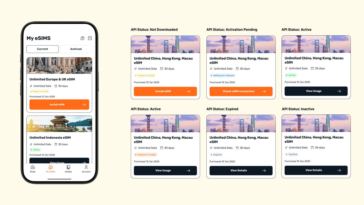
1. A Centralised “My eSIMs” dashboard
Rather than digging through emails or contacting support, users had one place to see all purchased eSIMs with live status and a clear next action.
All purchased eSIMs are visible in one place with clear indicators for whether they are installed, activated, or ready for action. The goal was to reduce uncertainty and give users an obvious next step immediately after opening the app.
2. Separating Install vs Activate Steps
Because many customers buy before they travel, I split setup into two explicit stages: install before travel, activate after landing. This directly addressed the most common failure point from CES feedback.
✅
Activation support tickets dropped from 19% to 11% of post-purchase volume
Each eSIM contains a clear two-step flow that reflects real user behaviour. Separating installation from activation made the process easier to understand and follow and reduced the risk of customers getting stuck mid-setup.

Progressive Guidance with the Simplest Default Path
Because eSIM setup can feel technical and unfamiliar, I designed the installation flow to prioritise the simplest path first while keeping alternative methods accessible.
For example, for Apple users, I defaulted to the automatic installation method, since it required the least effort for most users. At the same time, manual and QR options were available in tabs for those who needed them.
To reduce overwhelm, the flow reveals only the next necessary step at a time. This kept screens focused on action while still supporting users who needed more detail.
The automatic setup method is shown first to reduce friction, while manual and QR options remain available. Instructions are revealed step-by-step so users focus only on the action they need to take, helping simplify a technically complex process.
Impact
The app launched and quickly became the central place for customers to manage their eSIMs.
First month: 13.7% conversion with 42k+ new users
Six months in: 212k+ users with steady conversion around 6.6%
Activation-related support tickets dropped from 19% to 11% of post-purchase volume
Rated 4.8 on AppStore with 1,600+ ratings
The app shifted the experience from reactive troubleshooting to guided self-service.
What I’d improve
If I had more time, I would:
run more structured onboarding A/B tests
add automatic device compatibility checks earlier in the flow (which was implemented later)
explore deeper personalisation based on travel timing and device type