
✅ 9.28% mobile conversion uplift
✅ Support tickets halved
✅ eSIM revenue grew from 26% to 89%

Overview
As Simify expanded into new regions and accelerated its shift toward eSIMs, the website needed to scale without harming conversion or confusing returning customers.
In the first half of 2024, I led a series of iterative updates across product pages, navigation, and collection pages to support this shift.
ROLE
Sole Product Designer & Product Lead
PLATFORM
Shopify
TIMELINE
February 2024 - September 2024
COLLABORATORS
Developers · CRO Agency
Context
In January 2024, the site was still structured primarily around physical SIM cards. The main navigation point was a destination dropdown that customers knew well, but wasn’t built for an expanding catalogue.
The website didn’t reflect the growing customer interest in eSIMs and mobile conversion was significantly less than desktop.
As this was a growing business, there was no single brief or major update. Tests and changes were run on live site with real customers which made it challenging.
Throughout the first half of 2024, there were many smaller iterations to individual pages and components but I’ve highlighted the major iterations.
My Role
I was the sole designer across all three iterations, working directly with developers and a CRO agency without a dedicated PM. That meant owning both the design decisions and the prioritisation of what to tackle next.
Key Decisions
1. eSIM Product Page: Mobile conversion was lagging
Mobile conversion was lagging behind desktop. Working with the CRO agency, their analysis identified two root causes:
Customers didn’t understand the activation process
Data allowance and coverage was the most important information for buyer decision
Working from the findings, I refined and implemented a restructured product page that:
Prioritised coverage and compatibility by adding secondary buttons
Added additional activation information
Restructured the information hierarchy for small screens
Added multiple CTAs to reduce drop-off further down the page
A statistically significant A/B test showed a 9.28% uplift in mobile conversion rate.

Mobile product page restructured to prioritise coverage (not pictured), compatibility, and activation clarity. Added a pop up for detailed activation information that customers were missing.
2. Homepage Navigation: Scale without breaking familiarity
Destination dropdown on the homepage was the primary navigation tool, so instead of replacing it, I expanded it by introducing:
search suggestions
clickable popular destination tiles
clearer grouping for regions
This preserved existing behaviour while making the system scalable.
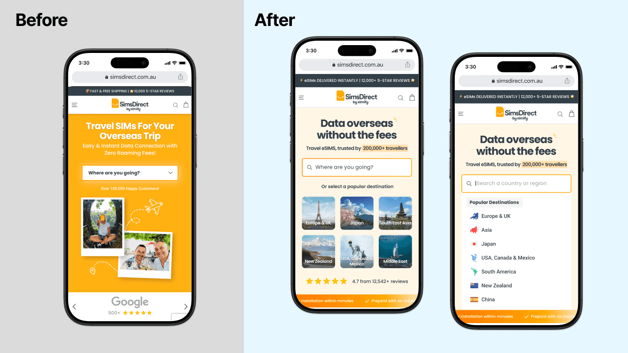
The redesigned search keeps familiar browsing patterns but introduces structured grouping and suggestions to accommodate expanding regions without adding friction.
Collection Pages: Make eSIM the default
Collection pages needed to do two things at once: nudge users toward eSIM while still serving customers who still wanted a physical card. Key changes included:
Making eSIM the default view on collection pages
Showing data allowance, validity, and coverage directly on product cards
Replacing the dropdown navigation with an embedded search inside the menu
Keeping physical SIM accessible
Click-through to product pages improved following this design change.

Product cards show important eSIM details upfront, allowing users to compare plans quickly. eSIMs are prioritised while SIM options are accessible.
Impact
Across the first half of 2024, eSIM grew from 26% to 89% of total revenue.
The site went from being structured around physical SIM cards to eSIMs based on customer demand and business needs.
While marketing drove overall traffic growth, the structural changes supported the shift toward eSIM by making it the default path across the journey.
9.28% uplift in mobile conversion from a CRO-validated A/B test
Collection page restructure improved click-through to product pages
eSIM share of revenue grew from 26% to 89% across the same period
What I’d do differently
I'd push for more structured A/B testing across all three iterations rather than just the product page — so we had cleaner data on what drove the collection page and navigation improvements specifically.